
Performance Trend Viewer
NetCrunch Trend Viewer is a tool for analyzing historical monitoring data, comparing metrics, and identifying performance patterns over time.
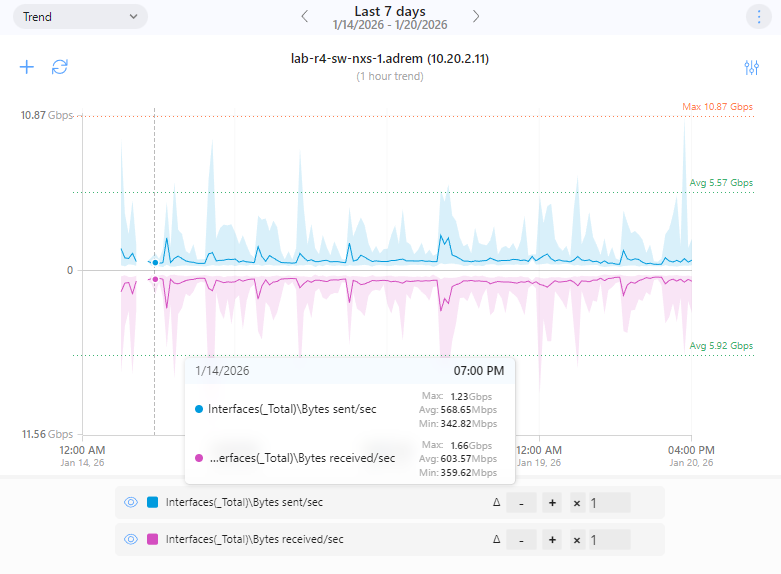
NetCrunch Performance Trend Viewer provides a focused environment for exploring historical performance data collected by NetCrunch. It is intended for analysis and investigation rather than real-time monitoring, allowing administrators to understand how metrics behave over time and across different scopes.
The viewer works exclusively on stored data and does not influence live polling, alerts, or monitoring load.
Purpose and typical use cases
Trend Viewer is used to:
- Analyze historical behavior of monitored counters
- Compare the same metric across multiple nodes
- Identify peaks, averages, and anomalies
- Detect daily and weekly usage patterns
- Support capacity planning decisions
- Investigate incidents after they occur
It complements dashboards and alerts by answering what happened over time rather than what is happening now.
Data scopes
Trend Viewer supports multiple data scopes, depending on what is being analyzed.
Node metrics
This mode displays performance metrics collected for a single node.
Typical examples include:
- CPU and memory utilization
- Disk usage
- Interface traffic
- Service availability
- Application or process-level counters
Users select a node and one or more monitored metrics, which are rendered as time-based charts.
Compare metric for multiple nodes
This mode is used to compare the same metric across multiple nodes.
Typical scenarios:
- CPU usage across servers
- Bandwidth usage across network devices
- Availability of the same service across endpoints
All nodes are visualized consistently, making it easy to identify deviations and outliers.
Server data
This scope is used for unbound or global data that is not associated with a specific monitored node.
Examples include:
- NetCrunch Server performance metrics
- NetFlow summaries
- Internal processing and workload statistics
This data is primarily used to assess the health and load of the monitoring system itself.
Visualization modes
Trend Viewer automatically selects the most suitable visualization based on data type and context, with manual overrides available.
Time-based trends
Standard line or area charts showing metric values over time.
Supported features:
- Adjustable time ranges
- Min, max, and average aggregation
- Optional percentile display
- Custom Y-axis scaling
- Reference and threshold lines
This is the primary mode for performance investigation.
Distribution and heatmaps
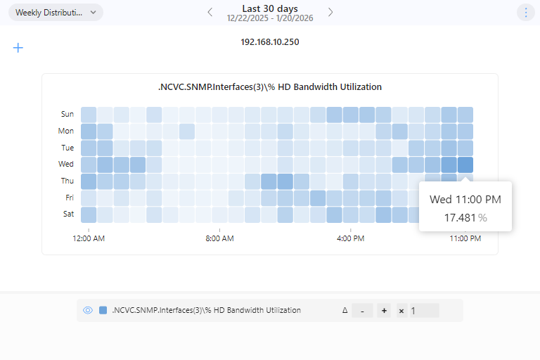
Distribution views visualize how values are spread across time, typically grouped by day of week and time of day.
This mode is useful for:
- Identifying recurring load patterns
- Detecting peak usage windows
- Comparing business and off-hour behavior
Each cell represents an aggregated value for a specific time slice.