
Graphical Dashboards
graphical-dashboards
Graphical Dashboards let you build fully customizable panels composed of live data widgets and dynamic visuals. These dashboards adapt to themes, respond to data changes, and offer interactive features for real-time monitoring and user-friendly operation.
Graphical Dashboards offer a range of interactive and responsive features that go beyond basic layout. This section highlights what you can do with dashboards, especially things that are not immediately visible.
$bk$$theming$
Theming Without Duplication
Each dashboard supports automatic theming, adapting to the user's interface theme (light or dark). You don't need to create two versions of the same dashboard—NetCrunch will automatically render colors, backgrounds, and widget styling.
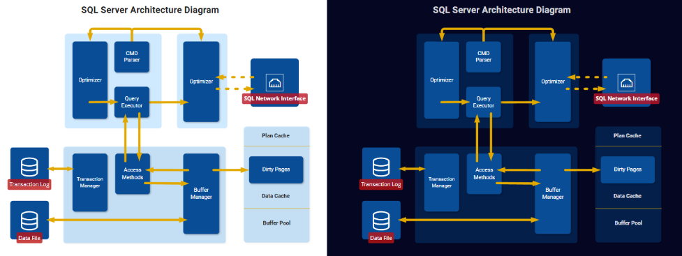
By default, the dashboard is in Auto mode, adjusting to the viewer's application settings. You can permanently make it Light or Dark.
Adaptive Panel Zoom
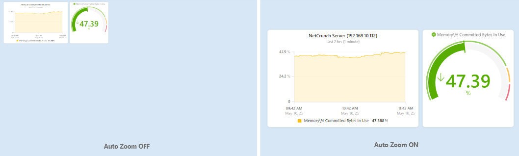
Dashboards are designed to display cleanly on screens of all sizes. Beyond scaling to aspect ratio, the Auto Zoom option adjusts the visible area dynamically:
- When enabled, the view zooms to focus only on the widgets you've placed, centered with appropriate padding.
- This makes the dashboard perfect for mobile or partial-screen use cases, where unused space is better hidden.
Widget-Based Visualization
While dashboards can include labels, icons, or shapes, their real power comes from data-bound widgets. These include:
- Value panels – display a single metric with optional caption and icon
- Bars – show linear comparisons or thresholds
- Gauges – visual dials (circular or linear) with multiple display modes
- Mini charts – embedded trend charts inside a widget
Most widgets are inserted in a "Themed" style by default:
- They include backgrounds and captions
- They automatically match the dashboard's current theme
- They use spacing and padding optimized for readability
Hidden Power in Widget Options
Each widget contains many powerful options grouped by function. These are not always visible unless the widget is selected and expanded in the editor:
- Display State Logic – shows status via color, arrows, or fill
- Threshold Ranges – define color bands for value ranges
- Change Indicators – visualize upward/downward trends
- Icon Overlays – replace background or add alert-like visuals
- Scaling & Unit Conversion – transform raw values on the fly
These options make widgets more intelligent and self-explanatory when properly configured.
Clickable, Live Elements
All dashboard widgets can be interactive: - Clicking a value widget or bar opens a tooltip with a live preview (e.g., trend or node state) - From the tooltip, users can open the Trend Viewer, Node Status, or perform actions - Visuals respond to real-time changes: flashing, color transitions, or icon switching
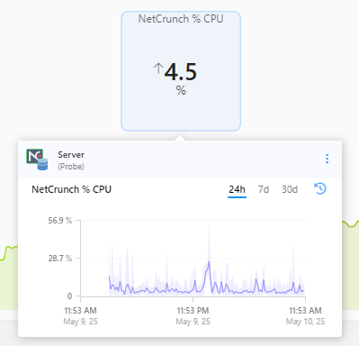
The dashboard is not static—it's a live control panel reacting to data.
Snap, Grid & Layers
The editor supports professional design tools behind the scenes:
- Grid snapping (toggleable)
- Alignment and spacing tools
- Bring to front / Send to back layering
- Group selection and multi-move
- Keyboard shortcuts for alignment, duplication, and locking
Though these features mimic tools like Figma or Illustrator, they're tailored to administrator workflows, not designers.
Visual Logic & State-Based Customization
Graphical Dashboards support two main classes of widgets:
Data Widgets
These display live data from counters or statuses:
- Bar
- Gauge (linear or circular)
- Line Chart
- Node icon
- Camera snapshot
They include a Data Source section where the user can bind:
- Node or object (e.g., sensor, interface)
- Counter or metric (e.g., % memory usage, traffic)
- Scaling, unit conversion, or rounding
Most support tooltips with live data previews and access to the trend viewer or node actions.
Reference-Based Widgets (Visual Elements)
These are static by default but become dynamic when bound to a State Reference: - Shapes (rectangle, triangle, blob, etc.) - Icons (font-based) - Symbols (vector-style images) - Pictures - Connection lines - Text and labels
Users can choose from 11 object types, such as:
- Node
- Interface
- Sensor
- Other widget
- Monitoring pack
- …and more
Setting Up a Reference Widget
To make these elements state-aware:
-
Assign State Reference
- Choose object type
- Select node and related object (e.g., sensor)
-
Select Object State
- Choose state to customize (
OK,Warning,Error, etc.)
- Choose state to customize (
-
Customize Visuals
- Modify opacity (can hide the element entirely)
- Change fill, line, stroke, border
- Use dynamic color, icons, or effects
- Customize per state or keep some properties common
Default styles are provided, but users can override every visual aspect.
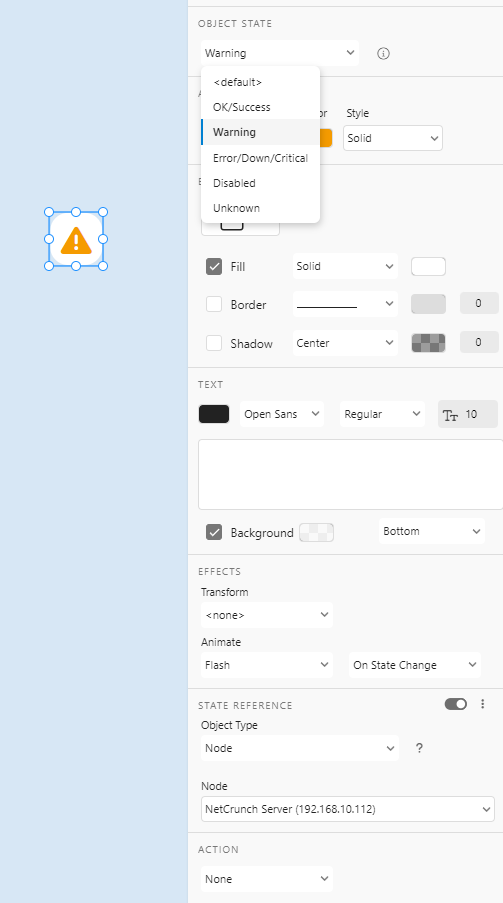
This lets you build shape- or icon-driven dashboards with precise reactions to live conditions.
Animation & Attention Effects
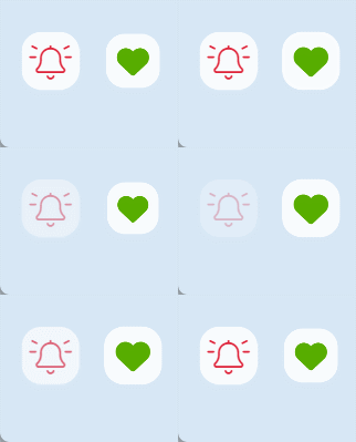
You can add animations triggered by state changes:
- Animate (e.g., flash, spin, pulse, heartbeat, wiggle)
- Transform (e.g., flip, rotate, scale)
- Trigger Mode (always, or on state change)
These subtle effects help focus attention on critical elements like failed links or overheating nodes.
Real-World Example
A shape or icon can:
- Represent a sensor or switch
- Flash red when a failure is detected
- Hide itself when disabled
- Change its icon or label text dynamically
- Open trend charts or alert details on click
NetCrunch lets you build SCADA-like behavior with far less effort.
Visual Resources
Dashboards support rich visual libraries to enhance layout and clarity.
Images (Pictures)
Pictures can be used for background diagrams, branding, or visual overlays.
They can be stored in:
- Document (local view-only)
- Shared (across multiple views)
- Public (global use within organization)
This system reduces duplication and makes it easy to reuse assets.
Symbols
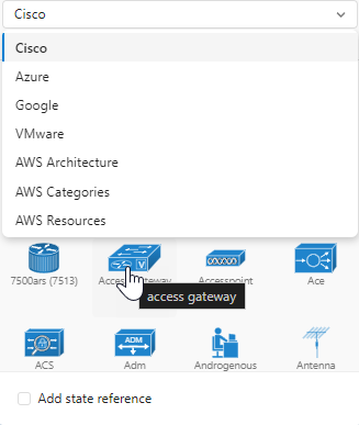
Symbols are vector-style images representing IT assets and services:
- Categories: Azure, Cisco, Google, VMware, AWS, etc.
- Fully searchable and grouped
- Treated more like images than icons (not font-based)
- Colorized if needed, but retain multi-color appearance
Icons (Font-Based)
NetCrunch supports over 3,000 icons via Font Awesome.
- Supports style: light, regular, solid
- Background shape: circle, hex, square, etc.
- Icon size and position control
- Can reflect the state when bound
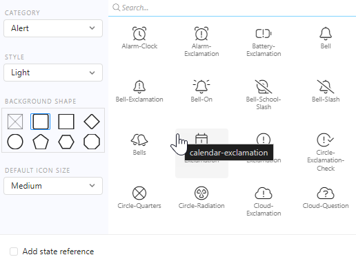
These icons are ideal for compact state indicators.
Vector Shapes
A full set of vector shapes is included:
- Geometric shapes: rectangle, circle, triangle
- Flowchart elements: process, decision, input
- Organic shapes: blobs, clouds, connectors
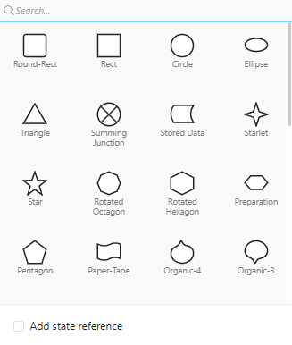
Shapes are fully editable and animatable. They can also reflect the system state.
Formatted Text
Text is written as Markdown rather than typed into a formatting toolbar, and how much of Markdown you get depends on which element you are writing in.
- Text widgets
- The full thing — bold, italic, headings, lists, links and code. Write it as you would any Markdown and it renders as written.
- Shape captions
- A deliberately small subset —
**bold**,*italic*and#headings only. Lists and links are not interpreted here, and blank lines are dropped.
If a list renders as list markup inside a shape, that is why — put the text in a text widget instead. A shape caption is meant to be a label, not a document.
Interactivity
All visual elements can be:
- Bound to state
- Styled per status
- Clickable for drill-down
- Used as part of composite widgets
A simple icon or shape can become an alert source or a dynamic indicator.
Connection Points
Elements that carry a node icon expose six points a connection line can attach to: the center of the icon, its north, south, east and west edges, and the bottom of the widget as a whole — the last being the useful one when the widget also shows a caption and you want the line to leave below it.
Plain shapes differ by outline. A circle offers five attachment points and a rectangle nine, since a rectangle adds its four corners.
Editing Basics
Graphical Dashboards include a visual editor with streamlined selection, linking, and widget creation tools. The left-side toolbar contains three context-sensitive selectors:
- Selection Tool – for selecting, moving, resizing, and editing existing widgets
- Connection Tool – allows creating connections between any widgets
- Widget Add Tool (+) – opens the widget gallery to insert new visual or data elements
When a new widget is dropped onto the canvas, the editor automatically opens a focused configuration panel. This avoids the need to browse through hundreds of settings initially.
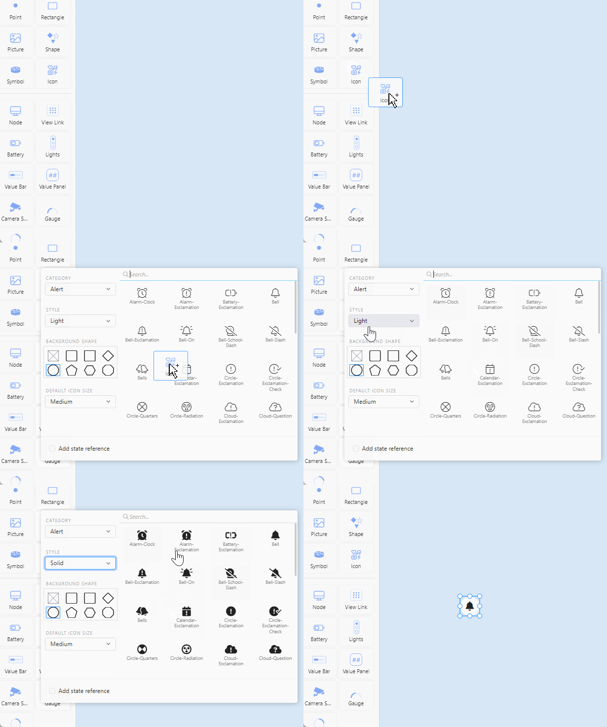
For example:
- Dropping a data widget opens a dialog to select a node and counter
- Dropping an icon launches the icon picker with category filtering and search
This approach makes the experience intuitive, even for users unfamiliar with visual editors.
Multi-Chart Insertion
The editor supports intelligent chart creation. When adding a graph widget, you can configure it in two flexible ways:
- Multiple series for a single node – helpful in comparing different counters (e.g., CPU, memory, disk I/O) on one device
- Single series across multiple nodes – compare the same metric across several nodes (e.g., bandwidth usage)
You can also check the "Put on separate graphs" option to automatically insert multiple graph widgets at once, each with one configured series.
This makes building visual comparisons quick and avoids manual duplication.
Context Menus, Locking & Power Shortcuts
NetCrunch's editor includes a right-click popup menu that reveals advanced object actions and selection tools, modeled after design applications like Adobe XD or Illustrator.
Context Menu Actions
When you right-click a widget, you'll find:
- Select... – choose all widgets of a certain type (e.g., all shapes, all rectangles)
- Align – align to edges, centers, or distribute evenly (see shortcuts below)
- Resize – normalize size to the smallest or largest
- Copy / Duplicate / Delete
- Lock – freeze widget in place so it cannot be moved or edited accidentally
- Bring to Front / Send to Back – control visual stacking of elements
Locking is essential for layered dashboards or background assets like images and shapes.
Alignment Shortcuts
NetCrunch uses Adobe-style shortcuts for alignment operations:
Ctrl + Shift + Left– Align leftCtrl + Shift + Right– Align rightCtrl + Shift + Up– Align topCtrl + Shift + Down– Align bottomCtrl + Shift + C– Align center horizontallyCtrl + Shift + M– Align middle verticallyCtrl + Shift + V– Distribute verticallyCtrl + Shift + H– Distribute horizontally
These shortcuts work with multiple selected widgets to polish the layout quickly.
Type-Based Selection
From the context menu, you can also select all widgets of a specific type, such as:
- All rectangles
- All shapes
- All icons or charts
This makes applying style or layout changes to multiple elements easy without manual selection.
Combined with locking and alignment, this allows users to work quickly across complex dashboards without misplacing key visual components.
Multi-Selection, Zooming & Canvas Control
The dashboard editor supports flexible multi-selection, layout duplication, and viewport control to speed up complex design tasks.
Selecting Multiple Elements
You can select multiple widgets using several intuitive methods:
- Selection rectangle – click and drag to select everything inside the blue box
- Shift + Click – add or remove specific items from your selection
- Context Menu → Select by Type – choose all rectangles, all shapes, etc.
- Ctrl + A – select everything on the dashboard
These tools allow efficient bulk operations like simultaneously moving, aligning, or styling multiple items.
Canvas Navigation
The canvas supports panning and zooming for large views:
- Drag background with Ctrl – pans the visible canvas area
- Mouse wheel – zooms in and out smoothly
- Zoom slider (top-right) – manually set zoom level
This makes navigating large or boundless views fast and natural.
Copy, Paste & Duplication
- Ctrl + C / Ctrl + V – standard copy & paste between views
- Ctrl + D – duplicates selected elements in-place
- Alt + Drag – creates a duplicate while moving the original
When an element has connections, any duplicated version will retain those connections. This is especially useful for replicating status-linked layouts or structured diagrams without manually reconnecting lines.
Widgets also preserve their configuration and references when duplicated or pasted, allowing rapid reuse of common visual elements or layouts.
These advanced selection and navigation capabilities make dashboard design fluid and powerful, ideal for constructing rich views quickly with precise control.